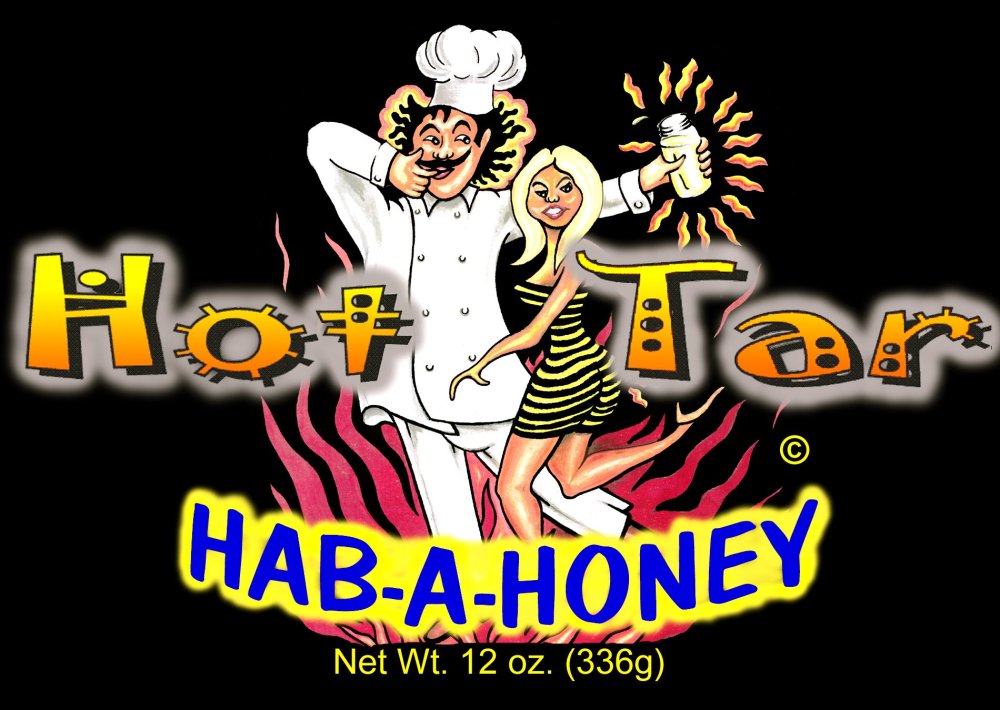
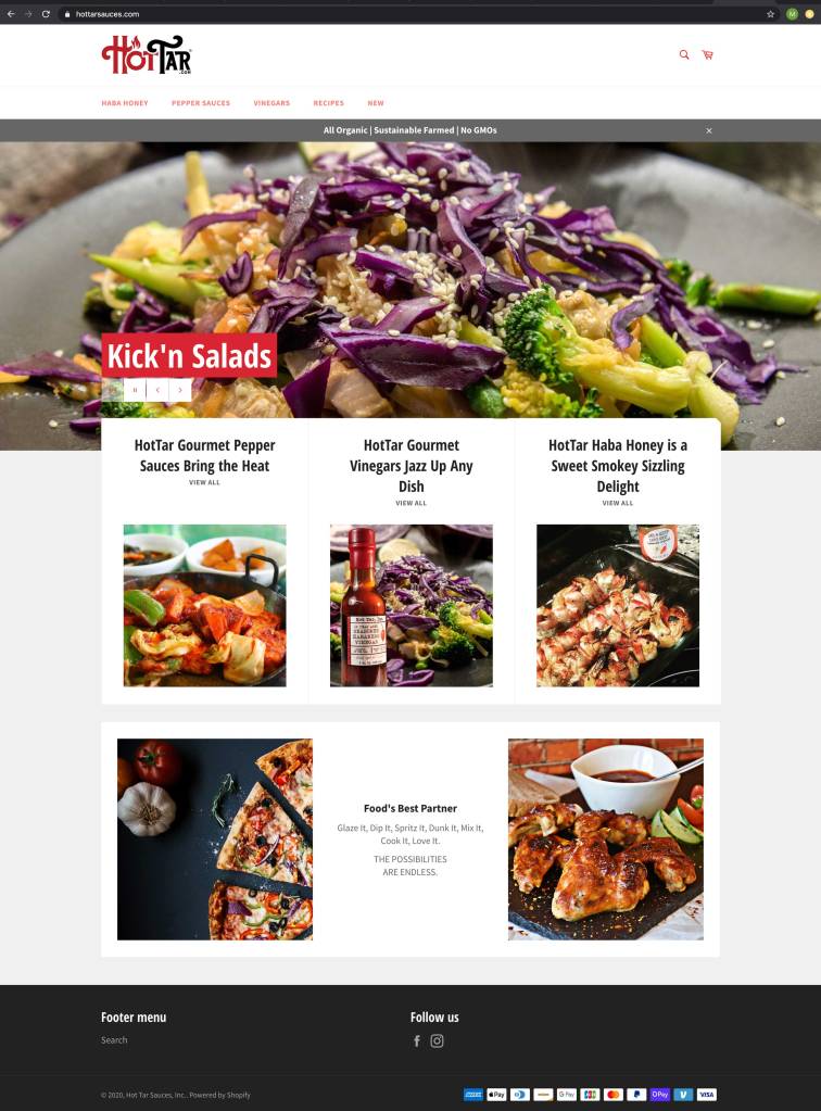
The final branding for HOT TAR® needed an overhaul, and so did their website, which I just launched. The previous branding was very abstract and hard to read. It did not speak to the nature of the product, and was too whimsical to reproduce well in multiple scenarios. I decided to take a classical approach, with an established feel- yet still allow for some whimsical undertones. We were quite pleased with the custom 1920’s style typography and curly ligatures that give a fun, rich brand experience- with a little naughty heat.
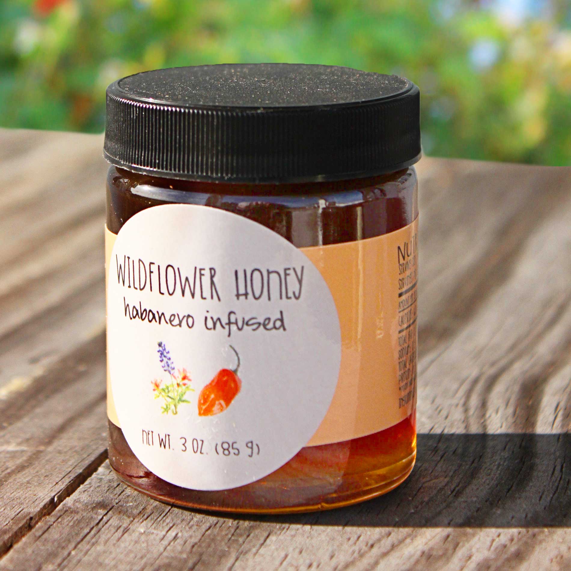
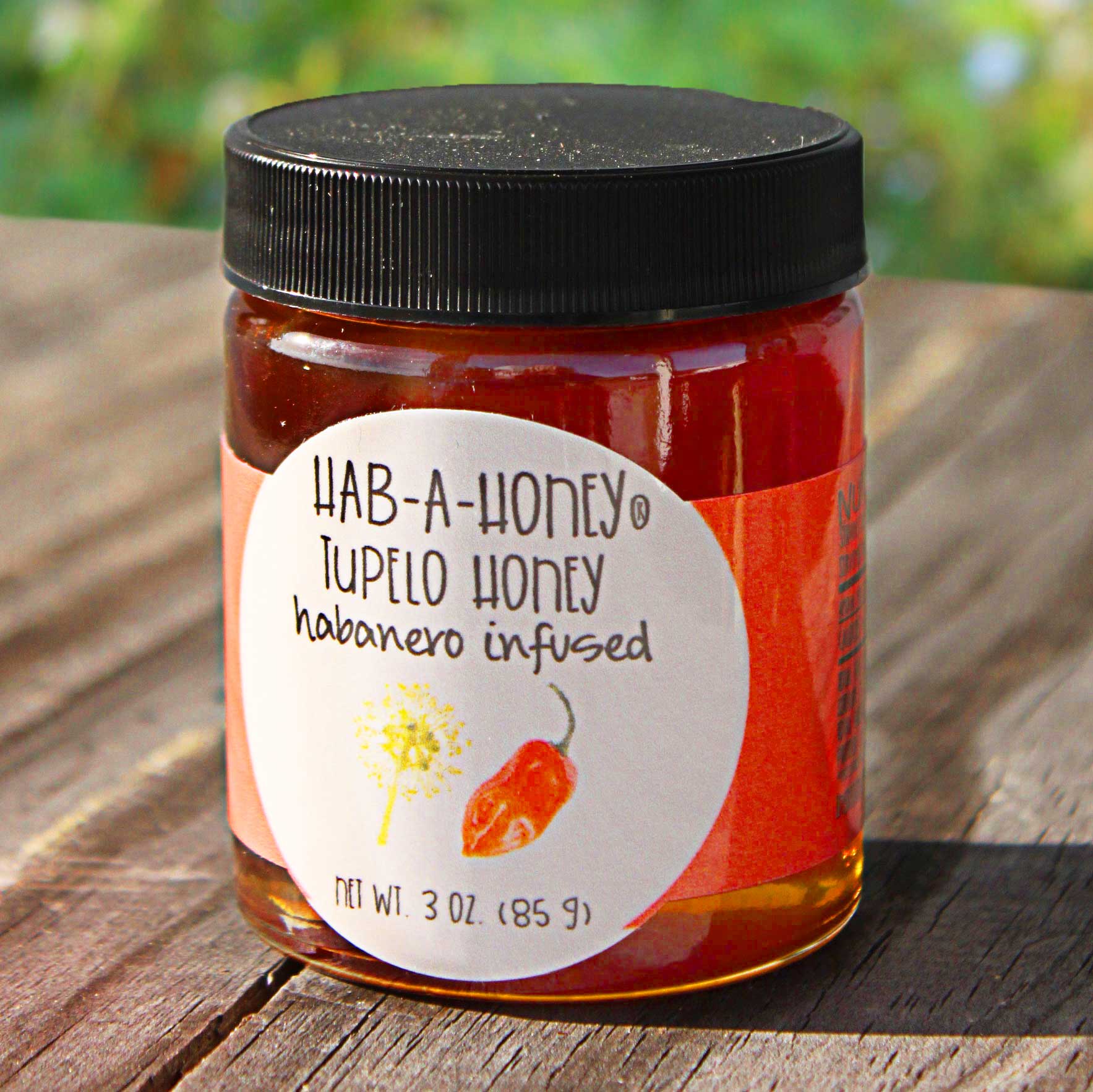
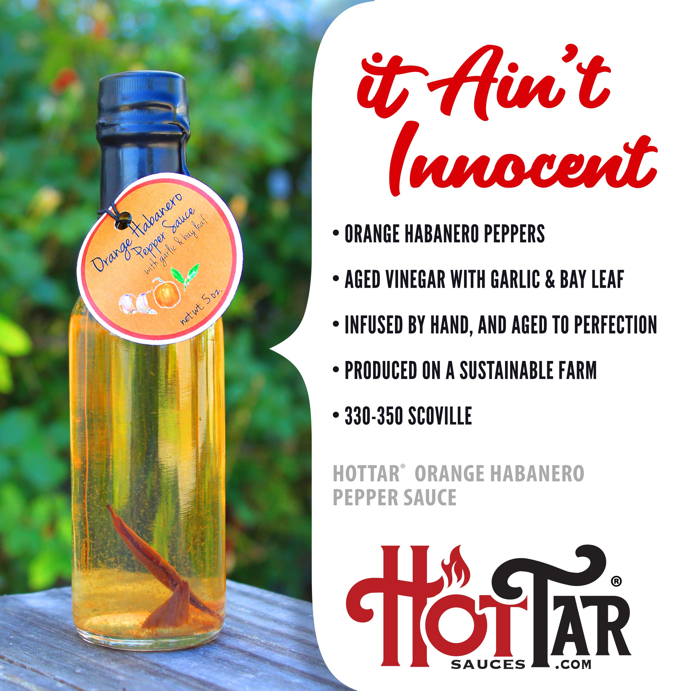
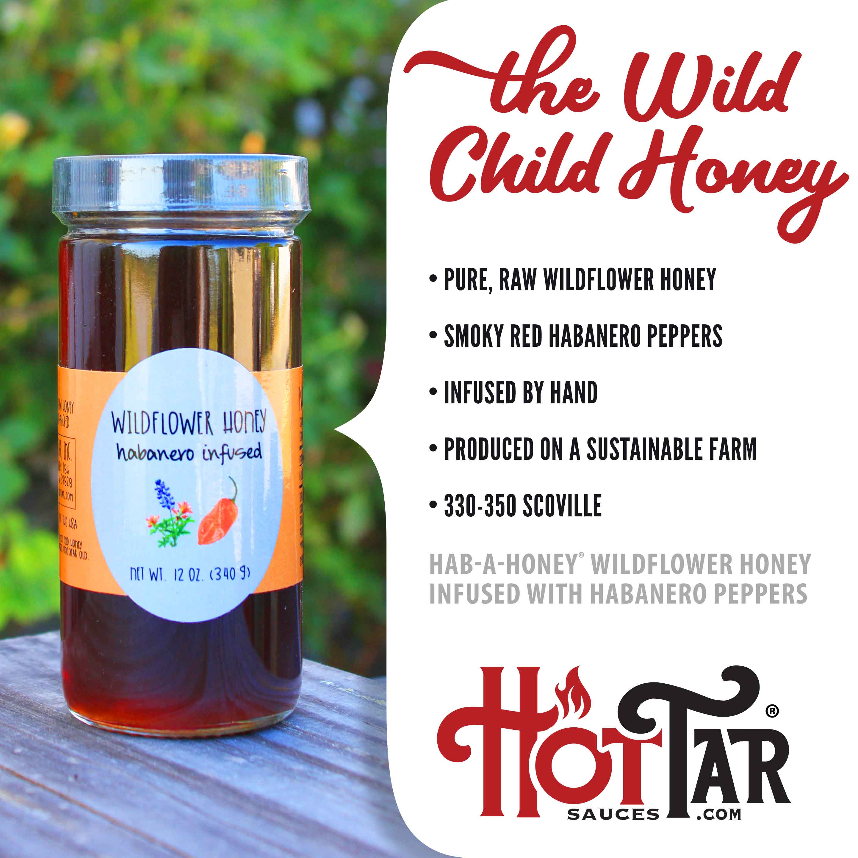
The original logo was gradient filled and did not flow or read well. It did not communicate effectively the product line. The previous artwork for Hab-a-honey® was very dated and did not hold up in many small scale uses, especially on labels. I am currently working on packaging for HOT TAR in my next project. Below are the current labels with new photography by Tedsauls.com and developed templates for the information cards used on the website.