- Maison.Health Website & Branding
I was tasked with developing branding, and creating a website to present their mission and professionalism that sets them apart in the growing market of at-home providers as our population ages. The color scheme is very progressive and forward thinking. The simple design is clean and sanitary implying the same quality of service to be expected.
- Branding & Product for Blue Grey Outfitters
Blue Grey Outfitters needed a more polished set of logos and new pattern for camouflage merchandise. We refined the fonts and recreated a side profile of their beloved mascot dog.
- ACS Solutions Branding
When AC Solutions reached out for branding their new LLC project, they wanted it to be inspired by the classic Jedi symbols from Star Wars fame. After several developed concepts we finalized a simpler, clean and modern design. The progressive cyan/blue and black fits with the futuristic and tech centered company. They were very satisfied…
- Belovese Medical Spa
Belovese Med Spa (belovese means beauty and grace) is opening soon with much fan fare in the local area. I have been hired for website, outdoor sign design and brand development. Updates to follow.
- Johnson Cattle Company Branding
Quality Georgia Beef gets professional branding.
- Weeks Naturals – 4th Quarter Website
A revamped website developed for the holidays to push a more refined and expensive product line. Weeks Naturals (Weeks Honey Farm) is rebranding its product line to showcase the premium taste of an all-natural life.
- The Can of Corn Club
A local sports enthusiast club dedicated to historical memorabilia and stories of days gone by wanted to create a vintage themed shirt around a drawing they had created years before. After cleaning it up I worked up an Illustrator version and finished it off in Photoshop to give it the final look. I kept much…
- FBC Moultrie
First Baptist Church Moultrie wanted to get back to its mission, while expanding it’s influence and impact both locally and beyond. They requested a modern look, with easy adaptability across multiple media. The result was a solid, san serif design that incorporated the number 1 into the cross, while at the same moment creating an…
- 4 Front Medical Group
A local group of established healthcare professionals have developed a new medical group and wanted a brand that portrayed a forward thinking ‘ahead of the curve’ image. The end result was a polished yet simple, clean design.
- Drew Davis Tennis Academy
Drew Davis is a local tennis guru of sorts. He asked me to help him develop a professional brand for the Tennis Academy he was building. Needless to say, I think the design speaks to his already established skill on the court, and does it with a classic vintage style. I may have to pick…
- Brand & Guide for CodeAlert
CodeAlert is a new Resusitation Solutions company that solves many problems for hospitals and reduces liability while improving patient care. The brand focuses around taking control of chaos. The logo itself is the inverse of the chaos symbol, and focuses on health and order. By taking control of the chaos, this product will save lives….
- HOTTAR® Packaging Design
HOTTAR requested some new package designs for their popular labels to make them on-brand to better represent their new logo and look. Below are the finals. Production images will follow soon in an updated post. All vector designs were created using Adobe Illustrator.
- Bigfoot Hiking Company
The client needed a logo and brand that inspired the iconic adventure of hiking the Appalachian Trail and used the legendary Bigfoot to be the star. Several revisions resulted in the imagery below. It will be used in all manner of merchandise from shirts, patches, decals and leather products. This design will also be used…
- Temple Baptist Church
Temple Baptist Moultrie, Georgia wanted to develop an image that solidified their stand on the Holy Word as well as their focus on Christ. After tons of revisions and font revisions we landed on a very traditional and clean design that holds true to their past, and pushes forward their mission. By combining the imagery…
- The Journey Project
A local hospital is preparing an innovative faith based project to help patients deal with difficult transitions and possible end-of-life scenarios. The theme for this project is “The Journey”. I struggled with the visual concept for a while. The first thought was a compass, or a map icon, but all seemed to generic and impersonal….
- HOT TAR® Rebranding
The final result is fun, established, and a little naughty branding excellence!
- Gearheadz Garage
The direction given at the start of this project was to make something like the vintage Route 66 style and include gears and wrenches. The overall concept was good, but the common elements needed to be unique due to this being a standard in most garage logos. We worked out several options to finally go…
- HOTTAR®
Hot Tar Incorporated is a maker of fine infused gourmet Habanero sauces, honeys, and vinegar. Their previous branding was very cartoonish, hard to read, and did not relate well to the market they were trying to reach. We are going to reintroduce the brand back the to market and promote newly branded products to a…
- Life of Adventure Travel
An upstart agency used my services to develop a brand identity that focuses on hospitality and premium user experience. The main requirement was the pineapple, and the perception of quality and dependability. A vintage concept was developed to inspire confidence and promote the values of the agency towards their clients.
- Swartz Home Services
Swartz is a progressive pro cleaning service that uses modern methods that are superior and less abrasive than traditional ones. Their business model is expanding into interiors and needed an upgrade to convey all their services. Their logo and work van wrap now allows them to reach more clients and command their brand and stand…
- Crosby Family Farm
Branding development for a standing family farm business looking to expand into new markets. The logo is built to inspire a growing future, while paying tribute to a solid past of excellence and quality products from the family business. Packaging and website are also underway.
- The Barber-Tucker House
The Barber-Tucker House is experiencing a revival as an affluent bed and breakfast in the beautiful downtown of Moultrie, Ga. Known as the Jewel of Southwest Georgia, this Victorian home with massive wrap around porch and romantic mossy draped oaks is a perfect retreat from the bustle of modern life. They wanted a shirt designed…
- The Barber-Tucker House
Full rebranding with a clearer message and more defined logo is making the Historic Bed & Breakfast a fast growing destination for travelers and patrons across the East Coast. Adding Weddings and Events to their calendar has ensured their constant stream of visitors and revenue. Google Business, and Bing Business pages are also updated on…
- Grayson Legacy Films
Final logo design chosen by the client to be used in their video production and all branding. They desired a very traditional look, but with a very visual representation of their philosophy of passing knowledge from generation to generation and growing upon a firm foundation.
- Hattaway Ford Motor
This prominent dealership wanted a reboot of their business image. The Red Ford logo was preferred by the client because of the Ford Racing division. Classy serif fonts and clean lines provide stability, while at the same time mimic the racing heritage of Ford Motors.
- An Actual ‘Brand’
An actual cattle brand design for a client.
- Swartzentruber Medical Services LLC
Dr. Gary Swartzentruber needed a logo with a modern medical connotation for his LLC. His instructions were just put an S in a box beside the name. Simple enough, but what made this project special was it had to be completed in 24 hours, including my 8 hours sleep. 😁🙄😵. Needless to say it was…
- UDC Oversized B2B Postcard Design
The latest project is in the wraps and ready to make my client some larger sales! They are transitioning to the new logo and branding I helped them develop. See UDC for all your closing sale gifts! #udeserveacookie #tedsauls #b2b #marketing #print #design
- Pinefields Plantation Pine Straw Co.
We succeeded in another identity illustration for Pinefields Plantation. With a very conservative and classy design, this illustration logo communicates the quality straw and service provided by the established plantation.
- Blue Grey Industries LLC
Blue Grey logo design
- Pinefields Plantation
Pinefields Plantation was established in 1912 and is undergoing a relaunch of their brand. These two variants are useful for a variety of marketing options for this historic Georgia plantation. Created with Adobe Illustrator and Photoshop CC.
- You Deserve A Cookie
Prospex Promotions hired me to create a new brand model for their company UdeserveAcookie.com. This reboot is the first stage in a new branding strategy aimed at a higher price point market. It showcases a greater perceived value and enables a broader market base.
- Blue Holler Bluegrass Band
I just wrapped up the branding and design for the release of Blue Holler’s newest album. This was a very rewarding project. Their music is classic, but with a modern twist. It was a blast bringing their style to the visual world. We are already working on the second album concept! Check them out at…
- 23d Maintenance Squadron Flying Tigers
I am proud to say that I have had a part in the history of my all-time favorite military organization, The Flying Tigers! The 23d Maintenance Squadron is based at MAFB Valdosta Georgia and asked me to work on recreating their patch. I am also developing coins for presentations and a stitch version. While I…
- BTB Marketing
On multiple occasions I was tasked with presenting United® Cutlery to new distributers by creating original, powerful presentations with data input from the Sales Manager. Here is my favorite, packaged in a slimline aluminum folder. Included were the United Master catalogs which I was the lead designer for the past 5 years.
- Protected: Protected: Logos & Branding
This content is password protected.
 I was tasked with developing branding, and creating a website to present their mission and professionalism that sets them apart in the growing market of at-home providers as our population ages. The color scheme is very progressive and forward thinking. The simple design is clean and sanitary implying the same quality of service to be expected.
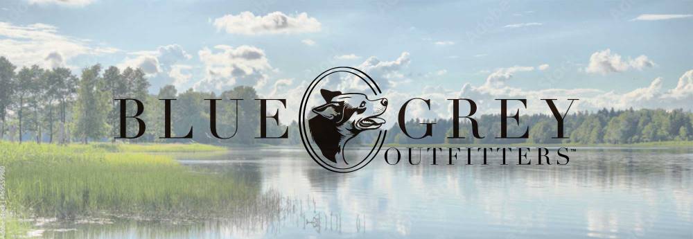 Blue Grey Outfitters needed a more polished set of logos and new pattern for camouflage merchandise. We refined the fonts and recreated a side profile of their beloved mascot dog.
 When AC Solutions reached out for branding their new LLC project, they wanted it to be inspired by the classic Jedi symbols from Star Wars fame. After several developed concepts we finalized a simpler, clean and modern design. The progressive cyan/blue and black fits with the futuristic and tech centered company. They were very satisfied…
 Belovese Med Spa (belovese means beauty and grace) is opening soon with much fan fare in the local area. I have been hired for website, outdoor sign design and brand development. Updates to follow.
 Quality Georgia Beef gets professional branding.
 A revamped website developed for the holidays to push a more refined and expensive product line. Weeks Naturals (Weeks Honey Farm) is rebranding its product line to showcase the premium taste of an all-natural life.
 A local sports enthusiast club dedicated to historical memorabilia and stories of days gone by wanted to create a vintage themed shirt around a drawing they had created years before. After cleaning it up I worked up an Illustrator version and finished it off in Photoshop to give it the final look. I kept much…
 First Baptist Church Moultrie wanted to get back to its mission, while expanding it’s influence and impact both locally and beyond. They requested a modern look, with easy adaptability across multiple media. The result was a solid, san serif design that incorporated the number 1 into the cross, while at the same moment creating an…
 A local group of established healthcare professionals have developed a new medical group and wanted a brand that portrayed a forward thinking ‘ahead of the curve’ image. The end result was a polished yet simple, clean design.
 Drew Davis is a local tennis guru of sorts. He asked me to help him develop a professional brand for the Tennis Academy he was building. Needless to say, I think the design speaks to his already established skill on the court, and does it with a classic vintage style. I may have to pick…
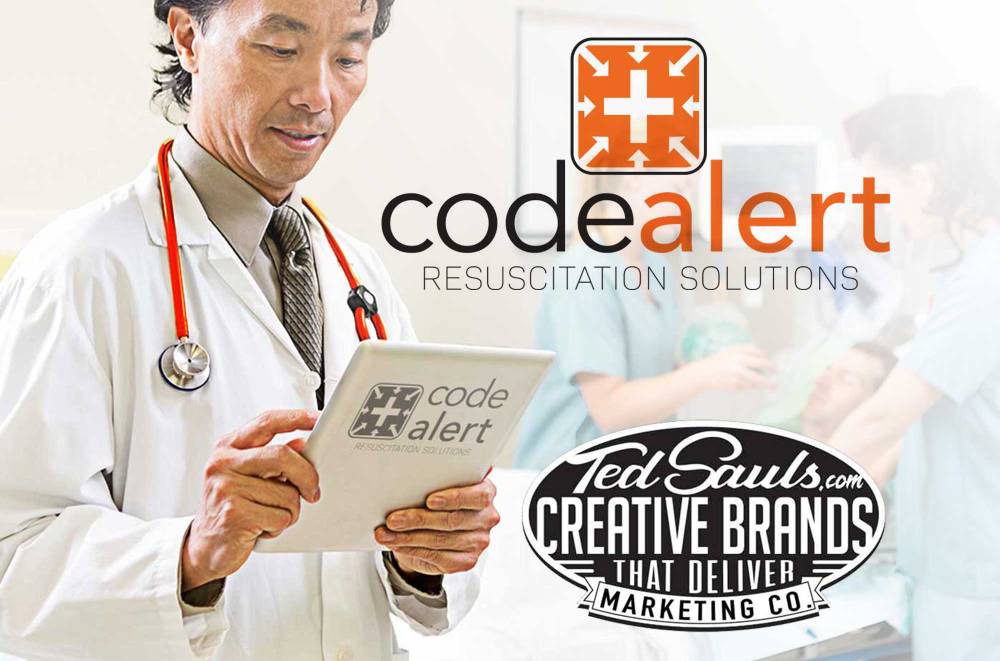 CodeAlert is a new Resusitation Solutions company that solves many problems for hospitals and reduces liability while improving patient care. The brand focuses around taking control of chaos. The logo itself is the inverse of the chaos symbol, and focuses on health and order. By taking control of the chaos, this product will save lives….
 HOTTAR requested some new package designs for their popular labels to make them on-brand to better represent their new logo and look. Below are the finals. Production images will follow soon in an updated post. All vector designs were created using Adobe Illustrator.
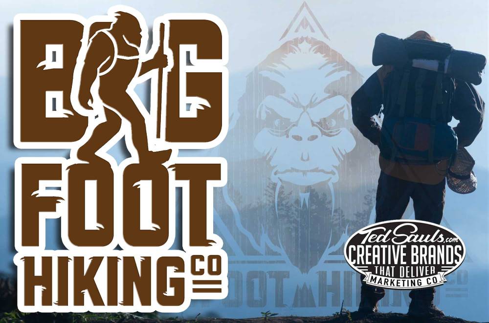 The client needed a logo and brand that inspired the iconic adventure of hiking the Appalachian Trail and used the legendary Bigfoot to be the star. Several revisions resulted in the imagery below. It will be used in all manner of merchandise from shirts, patches, decals and leather products. This design will also be used…
 Temple Baptist Moultrie, Georgia wanted to develop an image that solidified their stand on the Holy Word as well as their focus on Christ. After tons of revisions and font revisions we landed on a very traditional and clean design that holds true to their past, and pushes forward their mission. By combining the imagery…
 A local hospital is preparing an innovative faith based project to help patients deal with difficult transitions and possible end-of-life scenarios. The theme for this project is “The Journey”. I struggled with the visual concept for a while. The first thought was a compass, or a map icon, but all seemed to generic and impersonal….
 The final result is fun, established, and a little naughty branding excellence!
 The direction given at the start of this project was to make something like the vintage Route 66 style and include gears and wrenches. The overall concept was good, but the common elements needed to be unique due to this being a standard in most garage logos. We worked out several options to finally go…
 Hot Tar Incorporated is a maker of fine infused gourmet Habanero sauces, honeys, and vinegar. Their previous branding was very cartoonish, hard to read, and did not relate well to the market they were trying to reach. We are going to reintroduce the brand back the to market and promote newly branded products to a…
 Swartz is a progressive pro cleaning service that uses modern methods that are superior and less abrasive than traditional ones. Their business model is expanding into interiors and needed an upgrade to convey all their services. Their logo and work van wrap now allows them to reach more clients and command their brand and stand…
 Branding development for a standing family farm business looking to expand into new markets. The logo is built to inspire a growing future, while paying tribute to a solid past of excellence and quality products from the family business. Packaging and website are also underway.
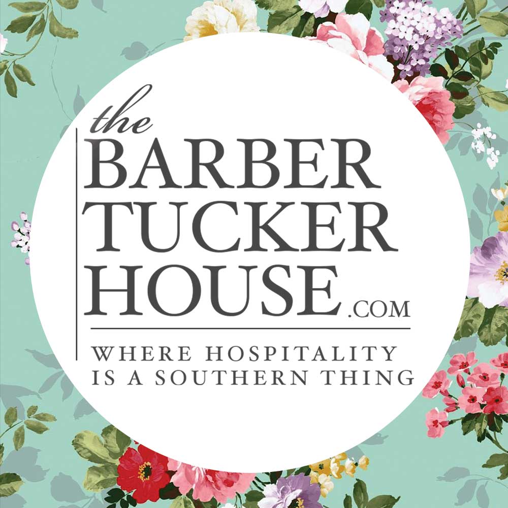 Full rebranding with a clearer message and more defined logo is making the Historic Bed & Breakfast a fast growing destination for travelers and patrons across the East Coast. Adding Weddings and Events to their calendar has ensured their constant stream of visitors and revenue. Google Business, and Bing Business pages are also updated on…
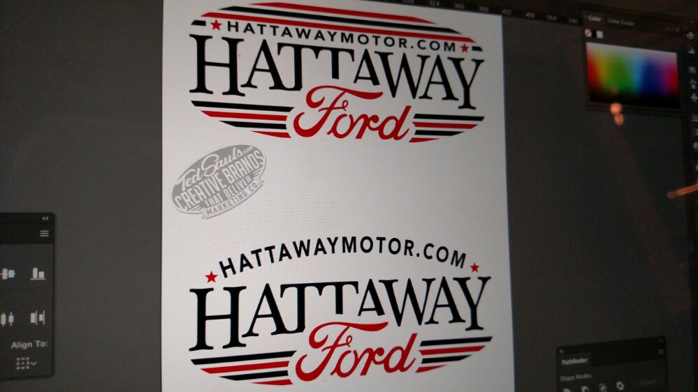 This prominent dealership wanted a reboot of their business image. The Red Ford logo was preferred by the client because of the Ford Racing division. Classy serif fonts and clean lines provide stability, while at the same time mimic the racing heritage of Ford Motors.
 Dr. Gary Swartzentruber needed a logo with a modern medical connotation for his LLC. His instructions were just put an S in a box beside the name. Simple enough, but what made this project special was it had to be completed in 24 hours, including my 8 hours sleep. 😁🙄😵. Needless to say it was…
 The latest project is in the wraps and ready to make my client some larger sales! They are transitioning to the new logo and branding I helped them develop. See UDC for all your closing sale gifts! #udeserveacookie #tedsauls #b2b #marketing #print #design
 We succeeded in another identity illustration for Pinefields Plantation. With a very conservative and classy design, this illustration logo communicates the quality straw and service provided by the established plantation.
 Blue Grey logo design
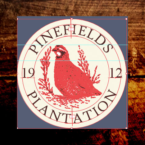 Pinefields Plantation was established in 1912 and is undergoing a relaunch of their brand. These two variants are useful for a variety of marketing options for this historic Georgia plantation. Created with Adobe Illustrator and Photoshop CC.
 Prospex Promotions hired me to create a new brand model for their company UdeserveAcookie.com. This reboot is the first stage in a new branding strategy aimed at a higher price point market. It showcases a greater perceived value and enables a broader market base.
 I just wrapped up the branding and design for the release of Blue Holler’s newest album. This was a very rewarding project. Their music is classic, but with a modern twist. It was a blast bringing their style to the visual world. We are already working on the second album concept! Check them out at…
 I am proud to say that I have had a part in the history of my all-time favorite military organization, The Flying Tigers! The 23d Maintenance Squadron is based at MAFB Valdosta Georgia and asked me to work on recreating their patch. I am also developing coins for presentations and a stitch version. While I…
 On multiple occasions I was tasked with presenting United® Cutlery to new distributers by creating original, powerful presentations with data input from the Sales Manager. Here is my favorite, packaged in a slimline aluminum folder. Included were the United Master catalogs which I was the lead designer for the past 5 years.
 This content is password protected.